FREE ASSISTANCE FOR THE INQUISITIVE PEOPLE


The default classes for the Bootstrap Buttons are
<!DOCTYPE html>
<html lang="en">
<head>
<title>Bootstrap Button Example</title>
<meta charset="utf-8">
<meta name="viewport" content="width=device-width, initial-scale=1">
< link rel="stylesheet" href="bootstrap.css">
<script src="https://ajax.googleapis.com/ajax/libs/jquery/1.12.4/jquery.min.js"></script>
<script src="https://maxcdn.bootstrapcdn.com/bootstrap/3.3.7/js/bootstrap.min.js"></script>
</head>
<body>
<div class="container" style="margin-top:50px;">
<div class="row">
<div class="col-md-6">
<button type="button" class="btn btn-default">Default</button>
<span style="color:#9E3434; font-weight:bold"> .btn-default </span> <br> <br>
<button type="button" class="btn btn-primary">Primary</button>
<span style="color:#9E3434; font-weight:bold"> .btn-primary </span> <br><br>
<button type="button" class="btn btn-success">Success</button>

<span style="color:#9E3434; font-weight:bold"> .btn-success </span> <br> <br>
<button type="button" class="btn btn-info">Info</button>
<span style="color:#9E3434; font-weight:bold">.btn-info</span><br> <br>
<button type="button" class="btn btn-warning">Warning</button>
<span style="color:#9E3434; font-weight:bold">.btn-warning</span> <br> <br>
<button type="button" class="btn btn-danger">Danger </button>
<span style="color:#9E3434; font-weight:bold">.btn-danger</span><br> <br>
<button type="button" class="btn btn-link">Link</button>
<span style="color:#9E3434; font-weight:bold">.btn-link</span>
</div>
<div class="col-md-6">
<button type="button" class="btn btn-outline-secondary">Secondary</button>
<span style="color:#9E3434; font-weight:bold"> .btn-outline-Secondary </span> <br> <br>
<button type="button" class="btn btn-outline-primary">Primary</button>
<span style="color:#9E3434; font-weight:bold"> .btn-outline-primary </span> <br> <br>
<button type="button" class="btn btn-outline-success">Success</button>
<span style="color:#9E3434; font-weight:bold"> .btn-outline-success </span> <br> <br>
<button type="button" class="btn btn-outline-info">Info</button>
<button type="button" class="btn btn-outline-info">Hover Info</button>
<span style="color:#9E3434; font-weight:bold"> .btn-outline-info </span> <br> <br>
<button type="button" class="btn btn-outline-warning">Warning</button>
<span style="color:#9E3434; font-weight:bold"> .btn-outline-warning </span> <br> <br>
<button type="button" class="btn btn-outline-danger">Danger</button>
<span style="color:#9E3434; font-weight:bold"> .btn-outline-Danger </span> <br> <br>
</div>
</div>
</div>
</body>
</html>
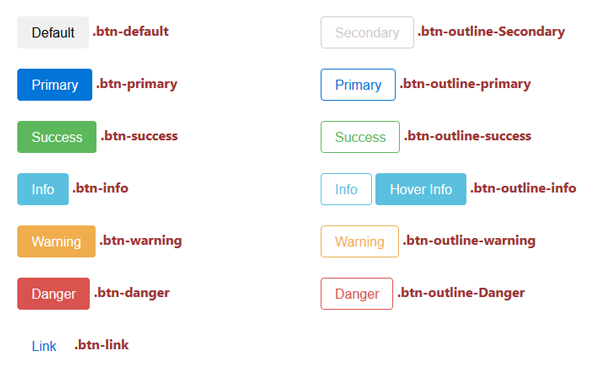
We can apply the classes in the <a>, <button>, <input> tag. button outline will introduce by next versions of bootstrap. but you can create it by custom CSS.
For setting the size of the button, we use the following classes

Note: Default class is .btn-md
<html>
<head>
<link href= "bootstrap.min.css" rel= "stylesheet" type= "text/css">
</head>
<div class="container">
<button type="button" class="btn btn-danger btn-xs"> XSmall </button>
<button type="button" class="btn btn-danger btn-sm"> Small </button>
<button type="button" class="btn btn-danger btn-md"> Medium </button>
<button type="button" class="btn btn-danger btn-lg"> Large </button>
</div>
</html>


If we set a button as active then the button displayed as pressed and look brighter. But if we set the button as disabled then it make an unclickable button and when we mouse over the button then mouse pointer turn to disable icon.
<button type="button" class="btn btn-danger btn-md disabled"> Disabled </button>
<button type="button" class="btn btn-danger btn-md"> Normal </button>
<button type="button" class="btn btn-danger btn-md active"> Active </button>

We can also create a block level button or full width button by using the .btn-block class.
<button type="button" class="btn btn-info btn-block"> Block Button </button>
<button type="button" class="btn btn-danger btn-block"> Block Button </button>